
What Is a CSS Box Model? Padding, Border & Margin

Alisha Anjum

Ever set an element’s width to 300 pixels, only to watch it spill past its container anyway? That mismatch between the number you typed and what the browser actually renders is one of the most common headaches in front-end work, and it almost always traces back to one concept.
So what is a CSS box model, exactly? It’s the rule set every browser uses to calculate how much space an HTML element takes up, based on four layers stacked around each other: content, padding, border, and margin. This article breaks down each layer, walks through the math for total width and height, compares the two box-sizing modes, and explains how block, inline, and inline-block elements behave differently under the same rules. You’ll also see how margin collapsing can throw off your spacing, and where a tool like Tools Repository fits into a faster CSS workflow.
By the end, you’ll know why your layouts break and exactly how to fix them.
Key takeaways
The box model has four layers: content, padding, border, and margin, each nested inside the last one.
By default,
widthandheightonly set the content area, not the whole visible box.box-sizing: border-boxkeeps sizing predictable and has become the modern standard for layout work.Block-level elements respect the full box model, while inline elements ignore width, height, and vertical margins.
Vertical margins between block elements can collapse into a single value instead of stacking.
Table of Contents
- What is the CSS box model?
- How do you calculate an element’s total width and height?
- What’s the difference between content-box and border-box?
- How does the box model differ for block, inline, and inline-block elements?
- Why do margins sometimes collapse?
- Simplify your CSS workflow with Tools Repository
- The takeaway
- Frequently asked questions
What is the CSS box model?
The CSS box model is the set of rules browsers use to render every HTML element as a rectangular box made of four nested layers, a structure formally defined in the CSS Box Model Module specification. Content sits at the center, padding wraps around it, a border frames the padding, and margin sits outside the border to create distance from neighboring elements. This structure applies to nearly every element on a page, from a single paragraph to a full page wrapper, though block-level and inline elements handle it a little differently, as you’ll see further down. Once you can picture these four layers stacking on top of each other, most CSS sizing bugs become far easier to diagnose.
Content, padding, border, and margin explained
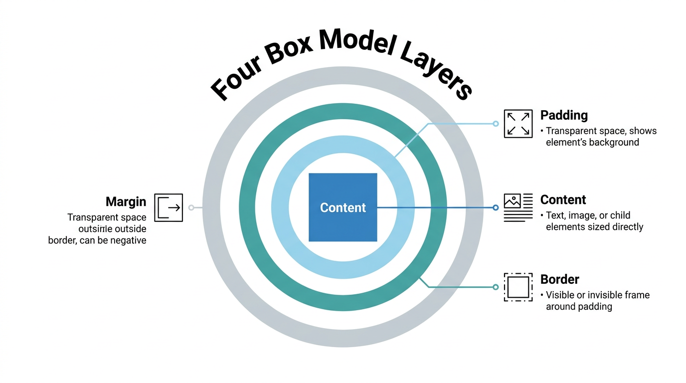
Think of the box model like a framed photograph on a wall. The photo itself is the content, the matting around it is the padding, the frame is the border, and the wall space keeping frames apart is the margin. Each layer has its own job, and CSS gives you separate properties to control every side of every layer.
Content is the text, image, or child elements you size directly with
widthandheight.Padding is transparent space between content and border; it can never go negative and always shows the element’s own background.
Border wraps around the padding as a visible or invisible frame and adds directly to the total size.
Margin is transparent space outside the border, can be negative, and controls the gap between separate elements.
How do you calculate an element’s total width and height?
Calculating total width and height means adding an element’s padding and border on top of its content size, at least under the default sizing rules. The formula works the same way for both dimensions: start with the value you set, then add the padding and border on both sides of that axis. Margin never enters this math because it sits outside the border and only affects spacing between elements, not the box’s own footprint. That’s why two elements with identical width values can look like different sizes once padding or borders differ.
Formula and worked example
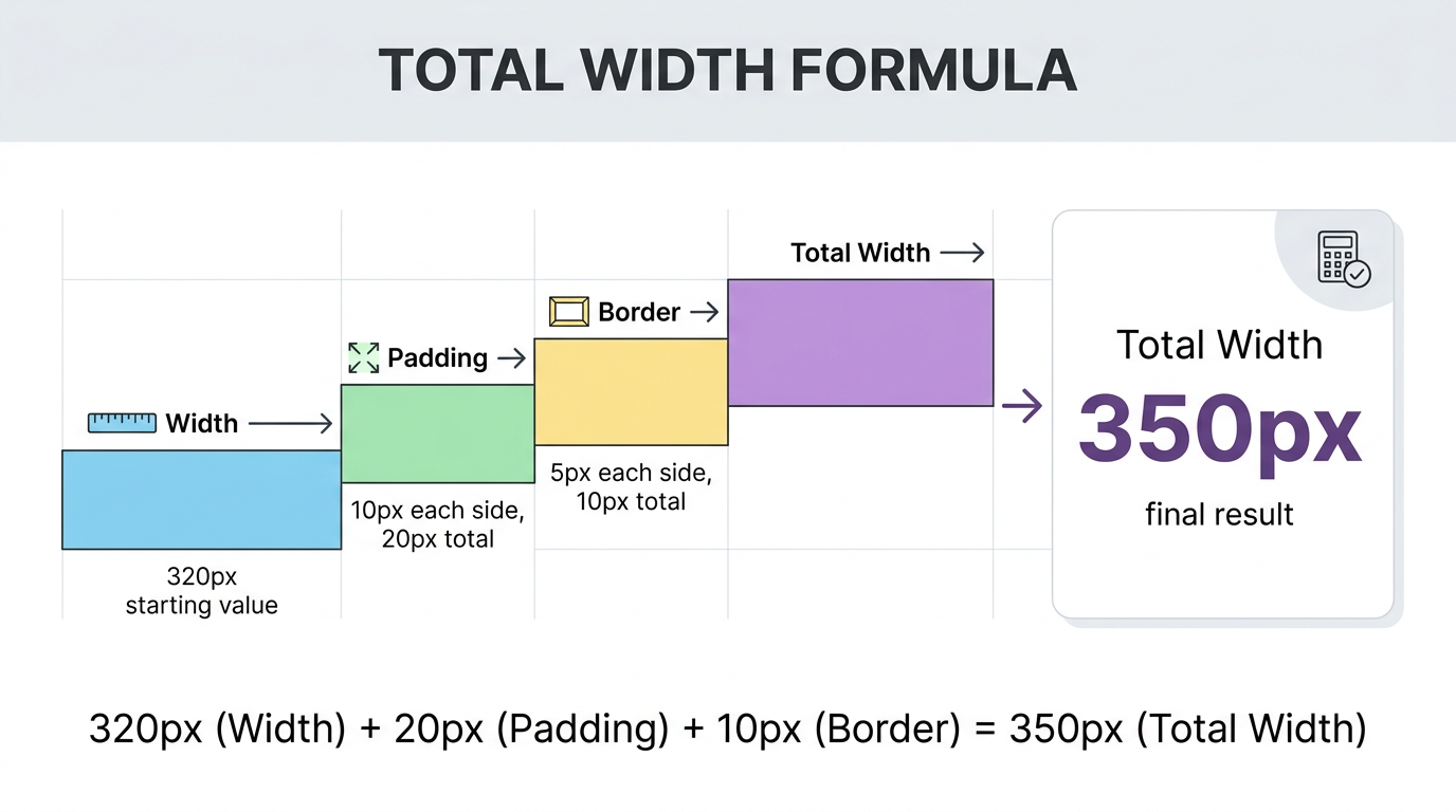
The formulas are simple once written out.
Total width = width + left padding + right padding + left border + right border
Total height = height + top padding + bottom padding + top border + bottom border
Say you set width: 320px, height: 50px, padding: 10px on every side, and a 5px solid border. Total width comes out to 320px plus 20px of combined padding plus 10px of combined border, landing at 350px. Height follows the same pattern, reaching 80px. Margin plays no part in either number; it only decides how far this box sits from whatever comes next.
What’s the difference between content-box and border-box?
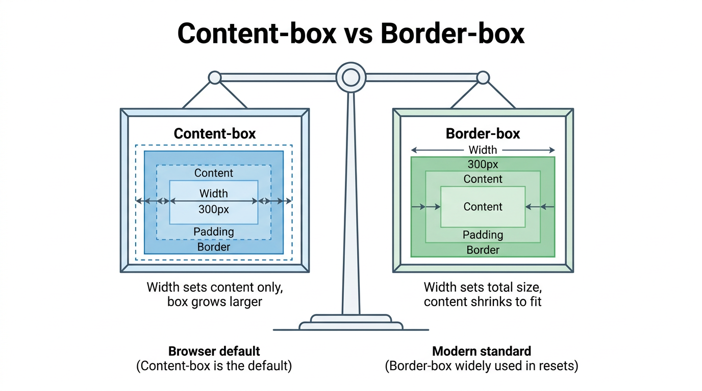
The difference between content-box and border-box comes down to what width and height actually measure. With content-box, the browser default, those properties set only the content area, then padding and border are added on top, growing the element beyond the number you typed. With border-box, the same properties set the total visible size, and the browser shrinks the content area internally to make room for padding and border instead. Both produce a real box, but they answer a different question about what “size” means, a distinction actively refined in the current CSS Box Model Module Level 4 draft, and most modern style sheets default to border-box specifically to avoid that confusion.
Standard box model: content-box
Under content-box, a div with width: 200px, 20px of padding per side, and a 2px border renders at 244px wide, not 200px. That’s the content plus 40px of combined padding plus 4px of combined border. Beginners often expect the width value to be the finished size, so this default is a frequent source of overflow bugs.
Alternative box model: border-box
Apply box-sizing: border-box to that same element and the total width stays locked at exactly 200px, with the content area shrinking to fit inside it. Many teams apply this globally with a short reset.
html { box-sizing: border-box; }*, *::before, *::after { box-sizing: inherit; }| What it measures | content-box | border-box |
|---|---|---|
| width/height apply to | Content only | Whole visible box |
| Padding and border | Added on top | Included inside |
| Browser default | Yes | No |
How does the box model differ for block, inline, and inline-block elements?
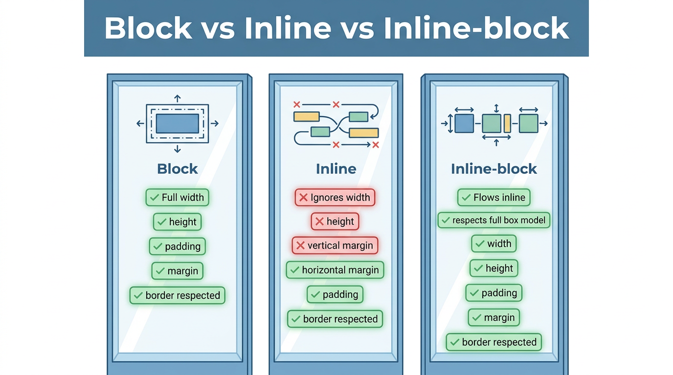
Block, inline, and inline-block elements each apply the box model in their own way, which explains why the same property can behave differently depending on what you target. Block-level elements, like <div> and <p>, respect width, height, padding, margin, and border in full, and each one starts on a new line. Inline elements, like <span> and <a>, ignore width and height entirely and let vertical padding overlap surrounding lines rather than pushing them away. Inline-block borrows from both, flowing inline while still respecting every box model property.
Block boxes vs. inline boxes
A block-level element always starts on a new line and stretches to fill 100% of its parent’s width unless you set a narrower value. Padding, border, and margin on a block element push surrounding content away on every side, exactly as the box model suggests.
An inline element flows within surrounding text instead of breaking onto its own line. Width and height have no effect, top and bottom margins are ignored, and top and bottom padding or border render visually but don’t push other lines away.
When to use inline-block
display: inline-block fixes cases where you want an element inline with text but still need control over its size. A common example is a navigation link inside an <li>, where inline-block lets you add padding for a larger click target without breaking the row onto separate lines.
Plain inline ignores width, height, and vertical margin, and can overlap padding vertically.
Inline-block respects width, height, and padding or margin on every side, while still sitting inline.
Why do margins sometimes collapse?
Margin collapsing happens when the vertical margins of two block-level elements touch and merge into one margin instead of adding together. This only affects top and bottom margins between elements in normal document flow, a scenario developers frequently troubleshoot in threads like width of child element overriding constraints, and it never touches padding, borders, or horizontal margins. The behavior catches developers off guard because the visible gap between stacked elements often ends up smaller than the sum of their margins would suggest.
Rules and a quick example
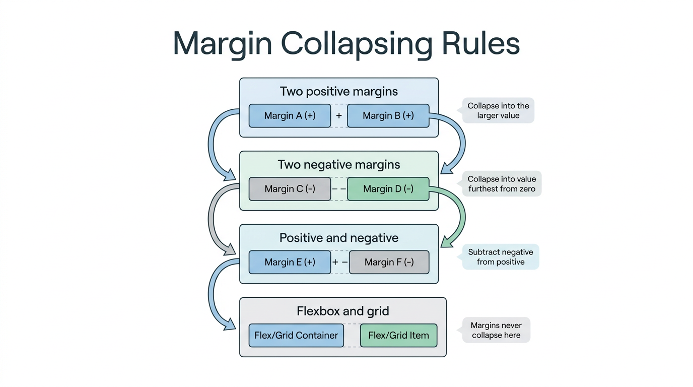
The rules are simple once you know them.
Two positive margins meeting each other collapse into a single margin equal to the larger value, not their sum.
Two negative margins collapse into the value furthest from zero.
A positive and a negative margin combine by subtracting the negative value from the positive one.
Picture a paragraph with margin-bottom: 50px above one with margin-top: 30px. The visible gap ends up at 50px, not 80px, because the larger value wins. This behavior never happens inside flexbox or grid containers, where every margin is honored in full.
Tip: if a gap between two stacked elements looks smaller than expected, check for margin collapsing before assuming your CSS has a typo.
Simplify your CSS workflow with Tools Repository
Once you understand how padding, border, and margin stack up, testing those values by hand can still slow you down, especially while experimenting with a new layout. Tools Repository offers free CSS generators and layout helpers that let you adjust padding, border, and sizing values and watch the resulting box update instantly, without writing a single rule from scratch. It’s a quick way to check how content-box and border-box math will actually render before committing changes to a live project.
Every tool on the platform runs directly in your browser, so nothing you type is stored, tracked, or sent anywhere. There’s no login, no installation, and no subscription involved, making it a practical option for students learning the box model or freelancers checking a client’s layout on the fly.
The takeaway
The CSS box model sits underneath every layout decision you’ll ever make, from spacing a single button to structuring a full-page grid. Once you can picture content, padding, border, and margin as nested layers, sizing bugs stop feeling random and start making sense, whether you’re troubleshooting an overflowing container or a link that won’t accept a width.
Make border-box your default, lean on browser DevTools whenever a size looks off, and keep the margin collapsing rules in mind before second-guessing your CSS. When you want to test padding, border, or sizing changes without touching a stylesheet, Tools Repository’s free, no-login CSS tools are built for exactly that kind of quick, private experimentation.
Frequently asked questions
Does padding or margin affect an element’s background color?
Padding affects how much of an element’s background is visible, since it sits inside the border and shares the same background color or image as the content. Margin never does this. It’s transparent space outside the border, so it always shows whatever sits behind the element instead.
Can I use browser DevTools to see the box model?
Yes, Chrome, Firefox, Edge, and Safari all include a visual box model diagram in their developer tools inspector. Select any element and you’ll see a color-coded set of nested boxes with exact pixel values for its content, padding, border, and margin, which makes debugging unexpected sizing far quicker.
Why doesn’t setting a width work on my span element?
A <span> is an inline element by default, and inline elements ignore width and height entirely, along with top and bottom margins. If you need to size it directly, switch its display value to inline-block or block, both of which respect the full box model.
Should I always use border-box for every project?
Not strictly, but most developers apply border-box globally because it makes sizing predictable, especially in responsive layouts built with percentages. It isn’t mandatory, and content-box still has valid uses, but border-box removes most of the sizing surprises that come from adding padding to a fixed-width element.