CSS Button Generator: Create Better Buttons Fast

Alisha Anjum
Styling buttons by hand can eat hours, especially when every page needs fresh call‑to‑action (CTA) designs. For web designers in 2026, one of the fastest free options is to use an online CSS button generator such as the one from Tools Repository. These tools let you design buttons visually and then copy ready HTML and CSS.
Without help, you juggle gradients, hover states, and responsive sizes while trying not to break layout. One small typo can leave a key button unreadable or unusable. On a busy project, that often leads to:
repeated snippets scattered across files
small spacing bugs that slip into production
buttons that look slightly different on every page
In this guide, you will learn what a CSS button generator does, which styles you can control visually, and how to build production‑ready buttons in minutes using Tools Repository’s CSS Button Generator. You will also see how color, copy, and accessibility affect clicks, so you can design buttons that feel better and work harder.
Key Takeaways
These key points give you a quick snapshot of the guide. Keep them in mind as you decide how to style your next buttons.
A CSS button generator lets you design buttons visually and then copy ready HTML and CSS. That shifts effort from low‑level syntax to real design decisions.
You can control colors, gradients, fonts, borders, padding, and shadows in one place. Hover settings and gradient options make call to action buttons stand out and support higher click rates.
Tools Repository’s CSS Button Generator is free, private, and runs entirely in the browser with no login. The clean output is ready for production use across school, freelance, or client projects.
Button choices affect conversions, accessibility, and user trust. Small tweaks to color contrast, wording, and size can produce large gains over time, especially on high‑traffic pages.
Table of Contents
- Key Takeaways
- What Is a CSS Button Generator and Who Needs It?
- Which CSS Properties Can You Customize With a Button Generator?
- How to Create a CSS Button in Minutes — Step by Step
- Why Button Design Directly Impacts Conversions and User Experience
- Accessibility and Code Quality: What to Check After Generating Your Button
- Lõpuks: Start Designing Better Buttons Today
- Frequently Asked Questions
What Is a CSS Button Generator and Who Needs It?

A CSS button generator is a browser tool that lets you design buttons visually and then copy ready HTML and CSS. Instead of hand‑writing styles for gradients, borders, and hover states, you adjust simple controls and see every change at once. When the button looks right, you copy the code and paste it straight into your project. No plugins, compilers, or downloads are required.
This kind of tool helps different groups for different reasons:
Front‑end developers and UI designers save time, because they can create a library of buttons without opening a full design suite or rewriting similar CSS from scratch.
Students and new coders gain confidence by watching how each control changes the underlying CSS. Moving a slider or color picker and then reviewing the code is a fast way to learn.
Freelancers and small business owners get professional‑looking call to action buttons even if they are not CSS experts. They can adjust a few options, copy the snippet, and move on to content or marketing.
Tools Repository’s CSS Button Generator focuses on this exact workflow. The tool runs inside your browser, shows a live preview, and produces clean, production‑ready snippets. You do not need an account, and the logic runs on the client side, so your button settings stay on your device. For a free, reliable generator in 2026, it gives web designers a simple, safe default choice.
“Good design is obvious. Great design is transparent.”
— Joe Sparano
Alongside Tools Repository, many designers still use Best CSS Button Generator and CSS3 Button Generator for quick presets. Those tools offer large style libraries and have been around for years. Tools Repository adds a modern twist by staying open‑source friendly, privacy conscious, and part of a wider set of browser‑based utilities. You can try several generators side by side and keep whichever output fits your code style best.
Which CSS Properties Can You Customize With a Button Generator?
CSS button generators give you tight control over the visual parts of a button. Instead of editing a stylesheet by hand, you move sliders and pick colors while the preview updates beside the controls. The main knobs cover color, typography, borders, spacing, and states such as hover. Once you know what each one does, you can match most design systems with confidence.
Tools Repository’s CSS Button Generator exposes all of these settings in a clean layout. You can switch between solid backgrounds and gradient button styles, test hover colors, and adjust shadows until the button feels right. The live preview makes it easy to compare options without opening your editor.
Here is how the main properties usually break down:
| Property | What You Control | Why It Matters |
|---|---|---|
| Background and gradients | Choose solid colors or multi‑step gradients for the button surface. | Strong contrast and gradient depth help key actions stand out on busy pages. |
| Font styling | Pick font family, size, weight, letter spacing, and text color for the label. | Matching your site typography keeps the interface coherent and easy to scan. |
| Border and radius | Adjust border width, color, style, and corner roundness. | Rounded corners and outlines change how clickable and modern the button feels. |
| Padding | Set space between the label and the edges on each side. | Good padding makes buttons large enough to tap while still looking tidy. |
| Hover and focus state | Define colors, gradients, and shadows that appear on hover or focus. | Clear hover feedback tells users the element is interactive and confirms their action. |
Many generators, including Tools Repository, also let you tweak:
Box shadow for subtle depth or strong “raised” buttons
Text shadow for extra contrast on busy backgrounds
Border style (solid, dashed, none) for secondary or outline buttons
Together, these options turn a simple CSS button generator into a capable button designer for the web. Whether you think of it as a button maker or an HTML CSS button generator, the goal stays the same: create buttons that are easy to spot and easy to use.
Research from Nielsen Norman Group shows that visitors decide in about 10 to 20 seconds whether a page feels useful, and studies on customizable front end design confirm that visual control over UI elements like buttons directly shapes user perception and engagement.
How to Create a CSS Button in Minutes — Step by Step
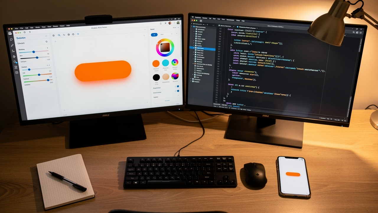
Creating a CSS button with a generator follows a simple flow. You open the tool, shape the design, then copy and paste the code. The whole process often takes less than a minute once you know your colors and text. Here is how it works in Tools Repository’s CSS Button Generator.
Open the generator.
Open the CSS Button Generator on the Tools Repository site in your browser. You do not install anything or create an account. Pick a base style or start from the default button, and keep your brand colors or style guide handy.Set your main styles.
Use the controls to choose background colors or gradients, pick a font, set border radius, padding, and box shadow, and decide on hover colors. The tool behaves like a CSS button maker online, but every change updates live beside the form. At this stage you can also:adjust font size so longer labels still fit
set border width and color for primary vs. secondary buttons
save a few reference values (for example, 8px radius for all buttons)
Fine‑tune hover and focus states.
Preview hover and focus states until the button feels right. You can quickly try different gradient button looks, shadow depths, and text sizes. This gives you fast feedback that would take many save‑and‑refresh cycles by hand. Aim for:a visible but not distracting hover color change
a clear focus ring for keyboard users
smooth transitions using
transitionif the generator offers it
Copy and paste the code.
When you are happy, copy the generated HTML and CSS code. Paste the CSS into your stylesheet and place the HTML snippet where you want the call to action to appear. The output works in personal or commercial projects, so you own the final result. You can also rename the class to match your naming scheme (for example,.btn-primary).Test inside your project.
View the page in your browser, resize the window, and try the button on both desktop and mobile. Check that the label stays readable, the hover and focus states work, and the button does not push nearby elements out of place.
Because the logic runs on the client side, Tools Repository never sees your colors, text, or project structure — an approach aligned with recent work on Optimizing Retrieval-Augmented Generation-Assisted User interface generation, which highlights the importance of data standardization and brand visual consistency in UI tooling. The CSS button generator behaves as a private HTML button style generator that you can open whenever you need a quick, production‑ready control.
Does the Generated CSS Work With Bootstrap and Other Frameworks?
Yes, the CSS from Tools Repository’s generator works with Bootstrap, Tailwind, and custom setups. The tool outputs plain HTML and CSS rules, so it behaves more like a framework‑friendly CSS button code generator than a tied template.
You can:
With Bootstrap: target classes such as
btn-primaryorbtn-successand let your new styles override the defaults.With Tailwind: drop the generated CSS under a custom class and combine it with utility classes for spacing or layout.
With CMSs and front‑end frameworks: paste the snippet into WordPress themes, React components, Vue single‑file components, or any static site.
Because the output has no external dependencies, you do not load extra libraries or scripts — a principle reinforced by research into DesignCoder: Hierarchy-aware and self-correcting UI code generation, which demonstrates that clean, self-contained code output is critical for reliable integration across frameworks. That keeps pages lighter and easier to debug.
Why Button Design Directly Impacts Conversions and User Experience

Button design affects both how people feel on a page and how often they take action. A well‑styled control guides the eye, signals safety, and makes the next step obvious. A dull or confusing button does the opposite and quietly hurts conversions.
Color does a lot of this work. Red often suggests urgency or warning, blue signals trust, green feels like approval, and orange adds friendly energy. With a CSS button generator you can try several palettes in minutes, swapping gradients and solid fills until one fits your brand and still stands out from the background. On top of that, testing a button against a neutral gray background can make it easier to judge whether the color itself has enough contrast.
Text on the button matters just as much as color. Short labels that start with strong verbs such as Get, Start, or Download set clear expectations. Phrases that describe a benefit, like Get My Free Guide or Save My Seat, usually beat generic words like Submit, because they answer the silent question in a visitor’s mind: “What do I get if I click?” Avoid vague labels such as Click Here or More wherever possible.
Research from HubSpot shows that personalized calls to action can increase conversion rates by more than double compared with generic ones. When you match sharp copy with a well‑tested style from Tools Repository’s CSS Button Generator, you give each click a better chance to turn into a signup, demo request, or purchase. Simple A/B tests on button color and wording can surface surprisingly strong combinations.
“Don’t make me think.”
— Steve Krug, Don’t Make Me Think
If a visitor has to pause and decode what a button does, that friction shows up in your analytics. Clear buttons, placed near relevant content and styled with care, help people move smoothly through your site.
Accessibility and Code Quality: What to Check After Generating Your Button
After you copy code from any CSS button generator, it pays to check accessibility and quality before shipping. Good buttons should work for people who use screen readers, keyboards, or small phones, not just for mouse users on a big monitor. Clean CSS also keeps your project easier to maintain.
Start with color contrast between the label and the background — a concern validated by recent benchmarks on whether generative AI can create accessible web code, which found that automated UI generation tools frequently fall short of meeting established accessibility standards without manual review. WCAG guidelines recommend a minimum contrast ratio of 4.5:1 for normal text, which usually means avoiding pale text on light gradients. According to WebAIM, more than four out of five home pages they tested had low‑contrast problems, so this step matters more than many teams expect.
Next, look at the markup and focus behavior:
Use a real
<button>element for actions (such as opening a modal or submitting a form) or a link with a clearhreffor navigation.Give each control descriptive text instead of only an icon. If you must use an icon‑only button, add an accessible label with
aria-label.Make sure you can reach the button with the Tab key and see a visible focus ring, so keyboard users always know where they are.
Check that click and keyboard activation both trigger the same behavior.
Touch target size is another easy win. On mobile, aim for at least 44×44 pixels of clickable area, including padding. You can adjust padding and font size in Tools Repository’s CSS Button Generator to reach that target without making buttons feel oversized.
“The power of the Web is in its universality. Access by everyone regardless of disability is an essential aspect.”
— Tim Berners‑Lee, W3C
Tools Repository’s CSS Button Generator helps here by outputting lean, readable CSS without unnecessary resets or comments. That makes it easy to combine the snippet with helpers such as the Gradient Generator, Box Shadow Generator, or Border Radius Generator on the same site. Because these utilities all run in the browser, you keep control of your code while still working faster.
For a quick post‑generation checklist:
Check color contrast with a contrast checker.
Test keyboard navigation and focus styles.
Try the button on a phone or tablet.
Skim the CSS for duplicate rules you already define elsewhere.
Lõpuks: Start Designing Better Buttons Today
A CSS button generator belongs in your daily toolkit. A visual editor replaces repetitive CSS tweaks while still giving you clean, ready‑to‑paste code. Tools Repository’s CSS Button Generator is free, private, and fast, and it sits beside helpers like the Gradient Generator, Box Shadow Generator, and Border Radius Generator. Research from Google links faster, clearer pages with lower bounce rates, and findings on customizable front end design further demonstrate that precise visual control over UI components like buttons leads to measurable improvements in interface quality and user satisfaction.
If you are working on a new landing page, sign‑up form, or navigation bar, open the generator in a tab, try a few variants, and save the CSS that performs best. Over time, you will build a small, consistent button library that keeps projects tidy and users happy.
Frequently Asked Questions
Question 1: Is a CSS button generator free to use?
Yes, Tools Repository’s CSS Button Generator is completely free to use in your browser with no hidden fees.
Question 2: Do I need to create an account to use an online button generator tool?
No, you use it directly in your browser, without signup or registration forms.
Question 3: Can I use the generated CSS button code in commercial projects?
Yes, you own the code and may use it anywhere, from client websites to personal SaaS dashboards.
Question 4: What is the difference between a CSS3 button generator and a regular CSS button generator?
CSS3 usually means support for modern CSS features like gradients, rounded corners, and shadows. Most current CSS button generators, including Tools Repository’s, support these features by default.
Question 5: Can I add hover effects using a CSS button generator?
Yes, the generator includes controls for hover colors and effects, and you can preview them live before copying the code.
Question 6: Does the generated button code work on mobile devices?
Yes, generated buttons work on responsive sites, and the tool itself loads well on phones. Make sure to keep padding and font size large enough for comfortable taps on touchscreens.