How to Create CSS Animations: A Beginner’s Guide

Alisha Anjum
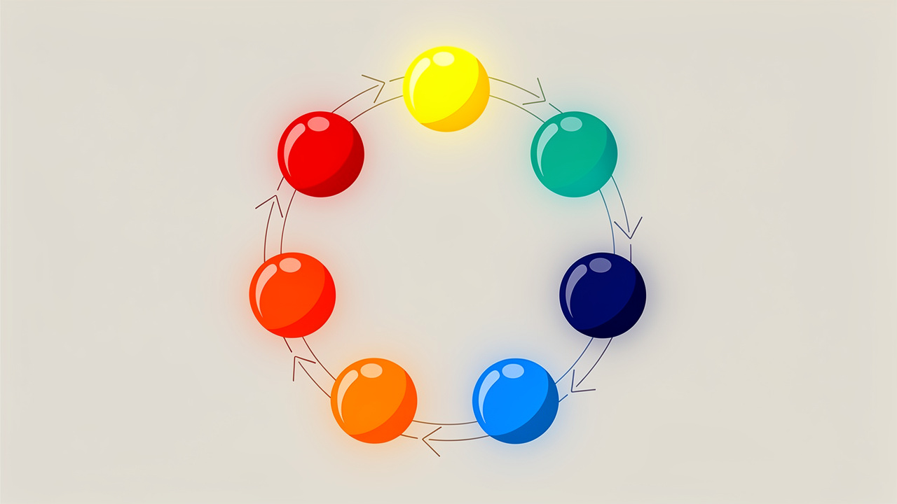
You want a site that feels alive, with buttons that glow and cards that slide into view, but you don’t want to write a stack of JavaScript just to make a box move across the screen. That’s exactly where learning how to create CSS animations pays off. Many developers get stuck juggling animation libraries or writing manual timing code when the browser already handles most of that work for free.
CSS animation is a built-in technique that shifts an element’s style step by step over a set time, using two parts. A @keyframes block defines the look at each stage, and a group of animation properties controls speed, repeats, and direction. This guide covers writing your first keyframe rule, configuring duration, delay, and timing, combining properties with the shorthand syntax, layering multiple animations, and a short list of best practices for motion that stays smooth and fast.
Let’s start with the basics before moving into full working examples.
Key takeaways
- CSS animations pair a
@keyframesblock with animation properties, so you can move, resize, or recolor elements without touching JavaScript. - Skipping
animation-durationis the most common mistake, since it defaults to0sand nothing will play. - The
animationshorthand property packs duration, timing, delay, and more into one tidy line of code. - Transform and opacity changes animate far more smoothly than width, height, or position shifts.
- Browser-based generators, including the ones on Tools Repository, let you preview keyframe code instantly without installing anything.
Table of Contents
- What are CSS animations and why use them?
- How do you define keyframes with the @keyframes rule?
- Which animation properties control timing and behavior?
- How does the animation shorthand property work?
- How do you apply multiple animations to one element?
- What are the best practices for smooth, performant animations?
- Build and preview animations faster with Tools Repository
- The takeaway
- Frequently asked questions
- Why is my CSS animation not working?
- What is the difference between CSS animations and CSS transitions?
- Can I animate CSS Grid or Flexbox properties?
- How do I make a CSS animation run only once?
- Can I pause a CSS animation with JavaScript?
- Do CSS animations work on all browsers?
- How long should a CSS animation last?
What are CSS animations and why use them?
CSS tools let an element’s style shift gradually over time using only two ingredients, keyframes and animation properties, with no JavaScript needed. The @keyframes rule stores the visual snapshots, while properties such as animation-duration and animation-name tell the browser how to play them back. Together these replace what used to take many lines of script with just a few CSS declarations.
Three real advantages make this approach worth learning. Writing animations in CSS takes far less code than building the same motion with a script, which keeps stylesheets easier to read later. New capabilities like the progress() function in CSS are also expanding what’s possible without JavaScript, letting properties respond directly to scroll or element progress as the browser’s own rendering engine continues to optimize playback on its own.
How do you define keyframes with the @keyframes rule?
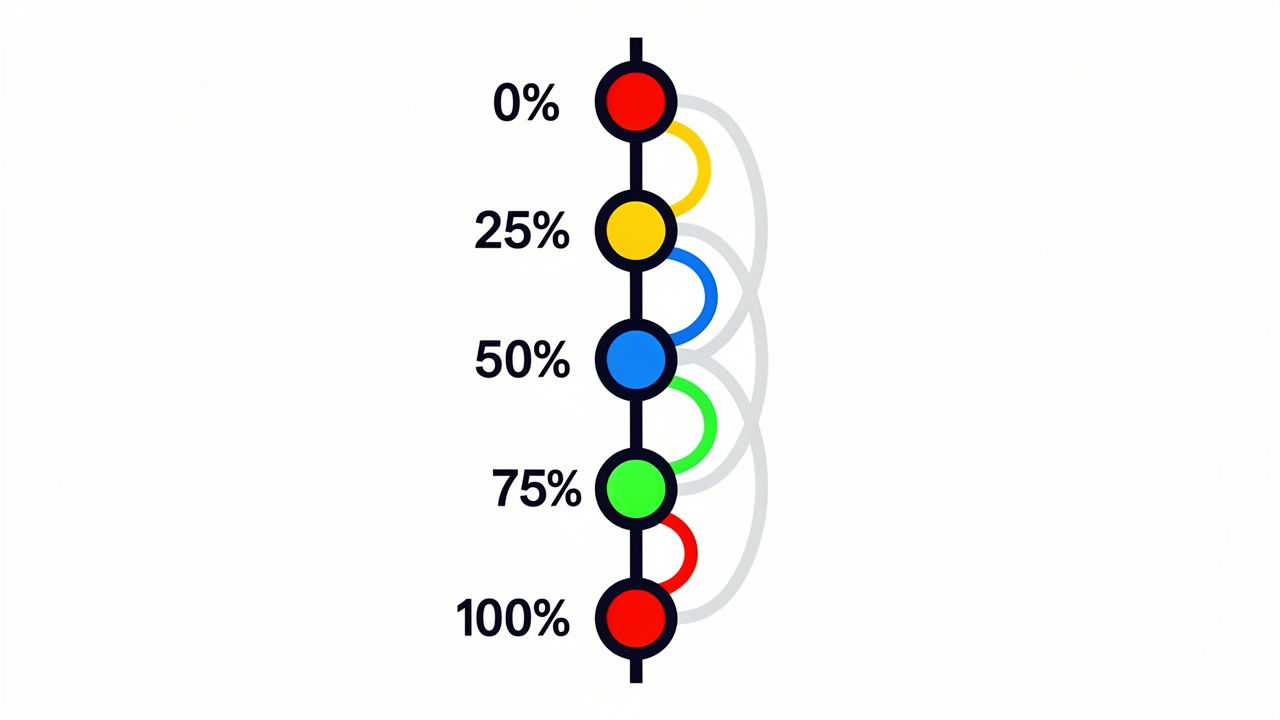
The @keyframes rule is the building block that tells the browser what an element should look like at specific moments during an animation. Keyframes use percentages to mark time, where 0% is the starting point and 100% is the finish, and CSS offers the friendly aliases from and to for those same two points. You can also drop in extra steps, like 25%, 50%, and 75%, to choreograph color changes, movement, or size shifts at precise stages along the way. If you skip the starting or ending step entirely, the browser just fills it in using the element’s current computed style, so you only have to define the stages that actually matter for your motion.
Example: a simple keyframe animation
A short example makes this concept click right away. The snippet below moves a box in a square pattern while cycling its background color through four shades.
@keyframes myAnimation {
  0%   { background-color: red; left: 0px; top: 0px; }
  25%  { background-color: yellow; left: 200px; top: 0px; }
  50%  { background-color: blue; left: 200px; top: 200px; }
  75%  { background-color: green; left: 0px; top: 200px; }
  100% { background-color: red; left: 0px; top: 0px; }
}
This same keyframe pattern is what powers common UI elements like a striped progress bar loader, where repeating gradients and position shifts combine to signal ongoing activity.
Which animation properties control timing and behavior?
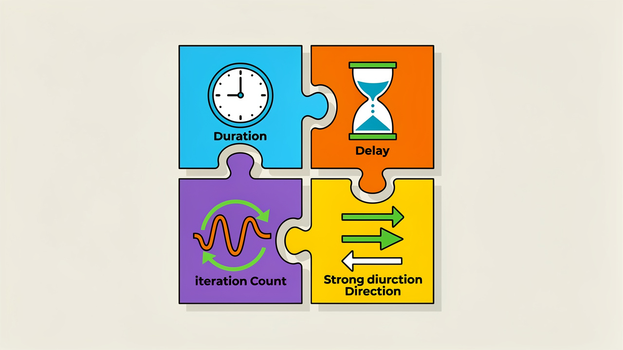
Animation properties are the settings that turn a static @keyframes block into motion you can actually see on the page. Each property handles one job, whether that’s naming which keyframes to use, deciding how long a cycle takes, or controlling how many times it repeats, and together they connect directly back to the @keyframes rule you just defined. Getting familiar with each one means you can configure almost any effect without guessing at syntax or copying code you don’t fully understand.
animation-name and animation-duration
The animation-name property is what links your element to a specific @keyframes block, and it must match that block’s name exactly or nothing happens. The animation-duration property sets how long one full cycle takes, written in seconds or milliseconds, and it defaults to 0s if left out. That default is the single biggest reason beginners write a complete animation and then wonder why the page sits perfectly still.
animation-delay and animation-iteration-count
The animation-delay property controls the wait time between page load and the animation’s first frame, which is handy for staggering several elements so they don’t all move at once. The animation-iteration-count property sets how many times the cycle repeats, accepting a plain number like 2 or the keyword infinite for motion that loops without stopping. Negative delay values are even allowed, letting an animation start partway through its own sequence.
animation-direction and animation-timing-function
The animation-direction property decides which way the motion runs on each pass, while animation-timing-function shapes how speed changes across that motion.
| Direction value | What it does |
|---|---|
normal |
Plays forward every time |
reverse |
Plays backward every time |
alternate |
Forward on odd runs, backward on even runs |
alternate-reverse |
Backward on odd runs, forward on even runs |
Timing functions work the same way for pacing, with linear keeping a constant speed, ease slowing at both ends, and ease-in or ease-out slowing at just one end.
animation-fill-mode and animation-play-state
The animation-fill-mode property decides what box shadow generator before and after the animation runs, and setting it to forwards keeps the final keyframe style in place instead of snapping back to the original look. The animation-play-state property lets you pause and resume motion using paused or running, which is useful for animations that should freeze when a user hovers or clicks.
How does the animation shorthand property work?
The animation shorthand property rolls several animation settings into one line, cutting down on repeated code. Instead of listing animation-duration, animation-name, animation-iteration-count, and animation-direction separately, you write something like animation: 3s infinite alternate slide-in; and the browser reads each value by its type.
Value order matters for anything expressed in time. The first time value is always read as the duration, and a second time value becomes the delay, while the animation name itself can sit anywhere in the line since the browser recognizes it by its unique spelling. This small bit of structure is what makes the shorthand safe to use even in longer stylesheets.
How do you apply multiple animations to one element?
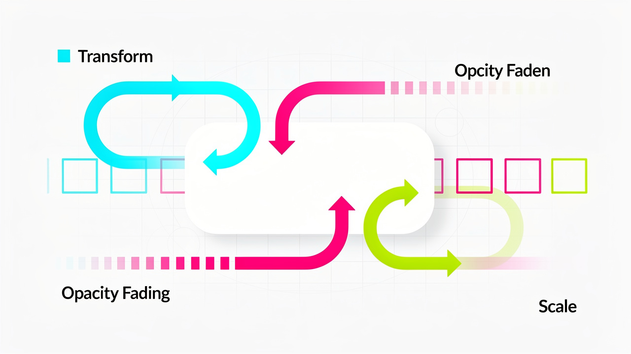
This layering technique is also how developers build animated data displays, such as a CSS bar chart that transitions bar heights and colors together using layered keyframe rules. Each animation in the list can carry its own duration, delay, and iteration count, matched up by position in the property list.
animation-name: fadeInOut, moveLeft300px, bounce;
animation-duration: 2.5s, 5s;
animation-iteration-count: 2, 1;
Here, fadeInOut gets a 2.5 second duration, moveLeft300px gets 5 seconds, and because there’s no third duration listed, bounce simply cycles back and reuses the first value. If you ever list more values than animations, the browser quietly ignores the extras, so there’s no need to count carefully every time.
What are the best practices for smooth, performant animations?
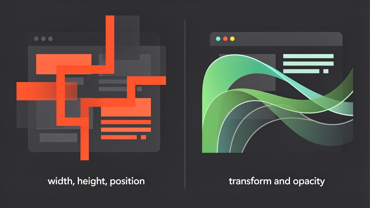
Smooth CSS animations come down to choosing the right properties and keeping motion brief enough to feel responsive rather than sluggish. Favor transform and opacity over gradient generator like width, top, or left, since transforms only touch the compositing stage of rendering while layout changes force the browser to recalculate the whole page.
Keep most animations short and purposeful, since anything stretching past a couple of seconds tends to feel like a delay rather than a feature. It’s also worth respecting the prefers-reduced-motion media query, which lets users with motion sensitivity turn off heavy effects, and testing across a few browsers catches the rare rendering difference before it reaches real visitors.
A few habits worth building into your workflow:
- Animate
transformandopacityfirst, and only reach for other properties when there’s no alternative. - Keep functional animations short, generally under a second, so the interface still feels snappy.
- Add
prefers-reduced-motionhandling early rather than bolting it on at the end. - Test the same animation in at least two or three browsers before shipping it.
Build and preview animations faster with Tools Repository
Tools Repository speeds up the whole process of experimenting with CSS animations by giving you a browser-based home for generators and CSS minifier you’d otherwise hunt down one by one. With over 100 free utilities covering web design, flexbox generator, and code formatting, you can sketch out a keyframe idea, clean up your CSS, or check your syntax without installing a single extension or creating an account.
Every tool on the platform processes your input locally, so code you paste in for testing never leaves your browser or touches a server. That privacy-first setup makes it a practical fit for students trying out their first @keyframes block and freelancers testing animation snippets for a client project without worrying where that code ends up.
The takeaway
Most real-world motion on the web comes from a small, repeatable pattern, a @keyframes block paired with a handful of animation properties like duration, delay, and fill mode. Once you’re comfortable with that pairing, the shorthand syntax and multi-animation technique are just shortcuts for writing the same ideas faster.
Start with one simple effect, like a fade or a slide, test it on border radius generator, and only then build toward layered, multi-step sequences. The free generators on Tools Repository are a quick way to preview that first attempt before committing it to your production stylesheet.
Frequently asked questions
Why is my CSS animation not working?
The most common cause is a missing animation-duration, which defaults to 0s so nothing ever plays. Double check that your animation-name spells the @keyframes block exactly right, since even a small typo breaks the connection silently with no error message.
What is the difference between CSS animations and CSS transitions?
Transitions need a trigger, like :hover or a class change, and move smoothly between two states. Animations run on their own once applied, can include several keyframe steps instead of just two, and can loop indefinitely using animation-iteration-count: infinite.
Can I animate CSS Grid or Flexbox properties?
Some grid generator can technically animate, but they trigger reflow, which costs more processing power and can cause visible stutter. It’s usually better to recreate the same visual effect using transform or opacity on child elements instead.
How do I make a CSS animation run only once?
Set animation-iteration-count: 1, which is also the default value if you never set it at all. Pair it with animation-fill-mode: forwards so the element keeps its final keyframe look instead of snapping back to its starting style.
Can I pause a CSS animation with JavaScript?
Yes, toggle the animation-play-state property between running and paused by adding or removing a class with a script. You can also listen for the animationstart and animationend events to coordinate other page logic around the animation’s timing.
Do CSS animations work on all browsers?
Core animation properties enjoy broad support across modern browsers, including Chrome, Firefox, Safari, and Edge. Newer capabilities, like animating the display property, have narrower support, so it’s worth checking current browser compatibility tables before relying on them in production.
How long should a CSS animation last?
Keep functional UI animations, like button feedback or menu reveals, under one second so the interface still feels responsive. Longer durations work better for decorative or storytelling effects where the motion itself is the point, not a quick confirmation.